Spatial Analysis
Go to the bottom of the page for a list of useful links to packages / algorithms used in this module of PalmettoBUG.
Getting Started
The initial steps towards Spatial Analysis are doing the image processing steps for your experiment (masking, region measurements, etc.), followed by transitioning to the single-cell analysis for that experiment and doing your clustering / annotation of the cells. If you have not done these steps, follow the documentation for those first!
What happens when you load the analysis for an imaging project is that the centroid data from the regionprops csv files in automatically loaded, ready for spatial analysis.
Important
PalmettoBUG spatial functions (except the EDT / pixel classifier option) use the centroids of the cells to calculate distances between cells, not the edges of the cells.
Once you have loaded the analysis from the imaging project & clustered and annotated your cells, you click to the Spatial tab:

There 3-4 major categories of spatial analysis, Spatial Neighbors, Neighborhoods, SpaceANOVA, and Distance(EDT)-from-pixel class.
Plotting Cells
The simplest style of spatial plot is the cell map. These just provide a view of the cells as they are positioned in the ROI / image, with the cells colored by their cell type / cell grouping:

There are two style of cell map, “masks” and “points” as shown above.
Spatial Neighbor analysis.
This section is all thin wrappers on squidpy (https://squidpy.readthedocs.io/en/stable/) functions, which use either a fixed radius or a fixed number of nearest neighbors for each cell to make a grid of spatial connections between the neighboring cells of each image. The creation of this grid is also necessary before doing neighborhood analysis.

Then, plots can be made of the raw number of interactions between cell types (“interaction matrix”) or the enrichment over random (by permutation test) of interactions between cell types, or plots of the centrality of the different cell types. There are three different types of centrality statistic that can be plotted (see squidpy documentation for details), but here I just show one type, closeness centrality:

Neighborhood Analysis.
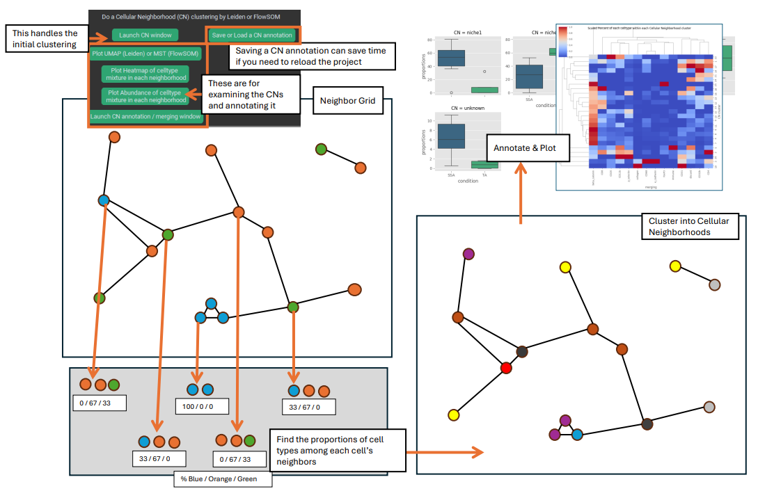
This section requires the grid of connected neighboring cells from Spatial Neighborhood analysis section to have been made. Using the previously identified connections between neighboring cells, this type of analysis finds the proportion of each cell type among the neighbors of each individual cell, then uses a FlowSOM or Leiden clustering to group the cells based on the proportions of its neighboring cell types. These groups, or “cellular neighborhoods” (CNs), can be used to represent distinct types of environments / niches in the tissue. In PalmettoBUG, plots of the proportion of cel types in each CN can be made to help annotate what these CNs might be in the tissue (for example, “T-cell enriched tumor”). Once a CN grouping has been created, it can be used in the same way as the non-spatial clusterings (“metaclustering”, “merging”, “ leiden”, “classification”) are in the single-cell analysis tab (once CNs are created, go back to the analysis tab and see that ‘CN’ will become available as a way of grouping/faceting plots). This includes creating plots like violin plots and abundance plots, as well as any other plots that use a cell groupings like these.
Cellular Neighborhoods:
SpaceANOVA
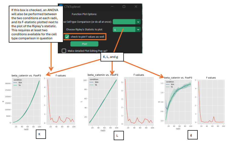
The section of spatial analysis options, SpaceANOVA, is a python translation of an R package with the same name (https://github.com/sealx017/SpaceANOVA). Specifically, what this allows you to do is calculate Ripley’s statistics (K / L) as well as the pair-correlation function (referred to as ‘g’ in the program) between all cell types in the data set.
A Graphical Explanation of Ripley’s statistics:
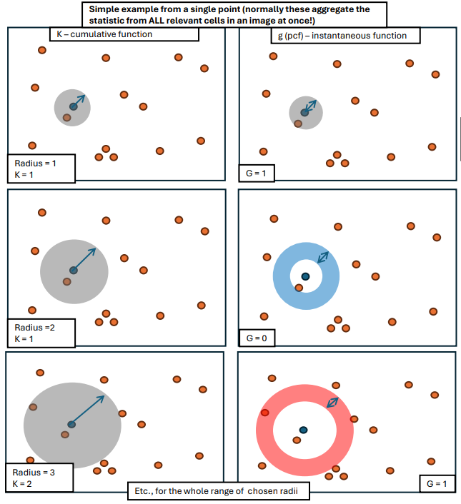
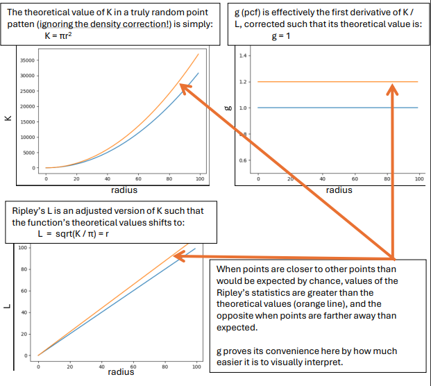
The key takeaways from the graphical example above is that the Ripley’s statistics provide a way to see if cell types are associating with each other more or less than would be expected by chance, creating a function with values at every radius of interest. In PalmettoBUG, these types of graphs can be calculated for every cell type –> cell type pair, with a few parameters, such as the range of radii, selected by the user:
Note
The comparison celltype A –> celltype B usually produces a slightly different statistic than celltype B –> celltype A, although typically these two statistics are very similar.
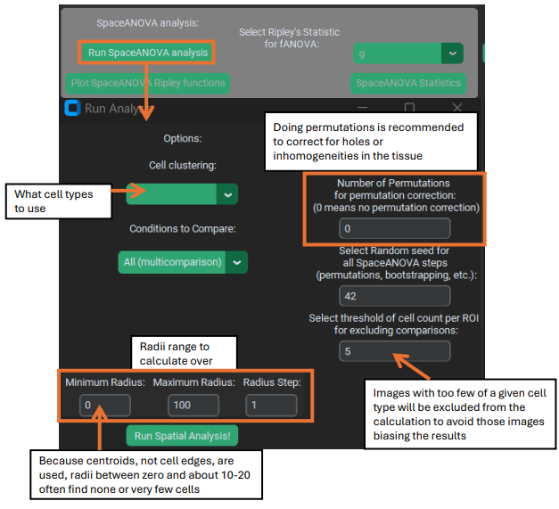
Some parameters of particular note are:
1). The permutation correction. This makes the SpaceANOVA analysis slower, but is almost always recommended. What this does is calculate the average Ripley’s K for a cell type over the selected number of random permutations where the cell type labels are randomly shuffled within each image. This permutation K is then subtracted from the K calculated from the actual data (unshuffled), which helps correct the final output for any peculiarities of the data itself – such as inhomogeneities / holes in the tissue that could shift the value of the K function even when the cell types are randomly distributed in the tissue.
2). The random seed. This is used for the shuffling of data in the permutation correction, but also for a few other steps in the SpaceANOVA pipeline, including the later functional ANOVA and plotting steps (they use bootstrapping that requires a seed). So this seed is ALWAYS relevant, even if you do not use permutation correction.
3). Cell Threshold. If an image has very few of a given cell type, it may not give a reliable result for the Ripley’s statistics. The threshold parameter lets you select the minimum number of cells of a particular cell type needed within an image for PalmettoBUG to proceed with calculating statistics for that cell type in that image.
Note
It can happen that a given cell type does not meet the threshold in ANY image of a given condition. In this case, PalmettoBUG will not use comparisons for that cell type / condition in the subsequent functional ANOVA test. However, even if a condition fails to meet the per image threshold like this, PalmettoBUG will still be able to plot the other conditions in the dataset that do still have valid statistics / images that met the threshold. PalmettoBUG will also print a warning to the terminal any time an image or an entire condition fails to meet the threshold – this often ends up being a lot of messages!
4). Radii min, max, step. These parameters set the range of radius values to calculate over. As in for the defaults (min = 0, max = 100, step = 1), Ripley’s statistics are calculated at around 100 points (0, 1, 2, 3, … 98, 99, 100). The statistics at zero, of course always = 0.
Note
The first few radii after zero essentially never find any adjacent cells because the distance between cells is calculated from centroid-to-centroid (not from cell edge to cell edge). In my experience, these first few radii tend to create a sharp spike in the g statistic that is presumably unreliable – so I expect setting the minimum radius somewhere in the range of 10-20 is reasonable in most cases, although the specific number depends on the proximity and size of your cell masks. If you see similar sharp changes in the g statistic over the first few radii for all your comparisons, that might indicate you may want to increase the minimum radius.
Once the SpaceANOVA calculation for the Ripley’s statistics has been performed, the buttons for plotting and statistics become available. For plotting the statistics themselves, PalmettoBUG lets you select a particular cell type –-> cell type comparison as well as the Ripley’s stat you are interested in, and also whether you like to add “F-values” to the plot.
These F-values are the F-statistics from ANOVA tests performed at every individual radius in the calculations, comparing the statistic of choice between the conditions in the dataset. This requires that there are 2+ available conditions for that cell type comparison (remember a condition could fail to meet the cell number threshold in all its images for a particular cell type). The F-values can be very useful for identifying at what distance the difference in cell type clustering between treatment vs. control is most statistically significant, but should not be used on its own as there is no correction for multi-comparison – instead the functional ANOVA should be used to determine if two conditions differ overall.
For statistically comparing the difference between how cell types cluster in conditions, SpaceANOVA uses functional ANOVA (fANOVA). This performs an ANOVA test on the entire Ripley’s function curve between the different conditions (using scikit-fda’s implementation of fANOVA: https://fda.readthedocs.io/en/stable/modules/inference/autosummary/skfda.inference.anova.oneway_anova.html). This approach means that the entire range of distance radii is tested at once for significance, and not a single cherry-picked distance. However, if the functional ANOVA finds a significant difference between the conditions over the entire range and you are interested in knowing which particular distance(s) the different between is most significant, then the F-value plots can be used (as discussed in the paragraph above).
PalmettoBUG automatically calculates the fANOVA values when you click the “SpaceANOVA statistics” button. You will then be able to either export the p-values from the fANOVA tests as a table, or plot them in a heatmap:
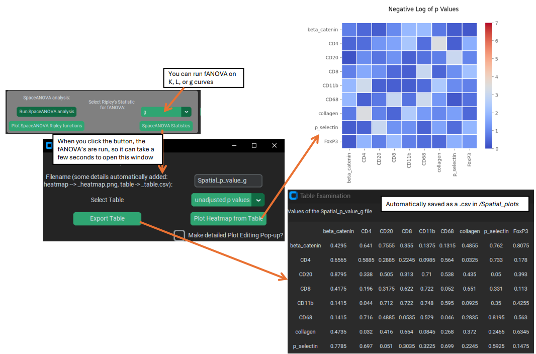
These p-value statistics can be calculated from K, l, or g. Note that it is not uncommon for most adjusted p-values to be at or near 1.0 (this is why I display the unadjusted p-values in the figure above). The raw p-values are adjusted by the Benjamini-Hochberg correction for False Discovery, to take into account the large number of comparison being made (one for each cell-type celltype pair).
Important
As currently set up, PalmettoBUG automatically uses all the derived p-values in the FDR adjustment process. However, it may not be wise to treat reverse-order comparisons (such as T-cell –> B-cell vs. B-cell –> T-cell) as independent tests needing correction for multi-comparison. Comparisons like these are NOT 100 % IDENTICAL, however they are understandably highly related to each other – I was not sure how to handle the FDR correction for these, so for now the default behaviour is just to correct them all as if they were independent hypothesis tests. If this is not preferred (it is likely too harsh in correcting for multicomparisons?), it should be fairly straightforward to take the matrix of unadjusted p-values calculated by PalmettoBUG and do a different p-value adjustment in another software.
Distance-to-Pixel Class
Sometimes the spatial question you want to ask does not only cells, but also non-cellular structures. In PalmettoBUG, the best way to identify non-cellular structures is with a (typically supervised) pixel classifier. PalmettoBUG allows you to take the output of a classifier and calculate the distance between cells masks and the pixel class. Examples of what could theoretically be done include cell distance from beta-amyloid plaques, or distance from fibrotic regions, etc.
To do this, a pixel classifier identifying the plaque / tissue / regions of interest on the slide must be created. How to create a pixel classifier & predict classification maps is not covered here! See the documentation for pixel classifiers to learn about those steps.
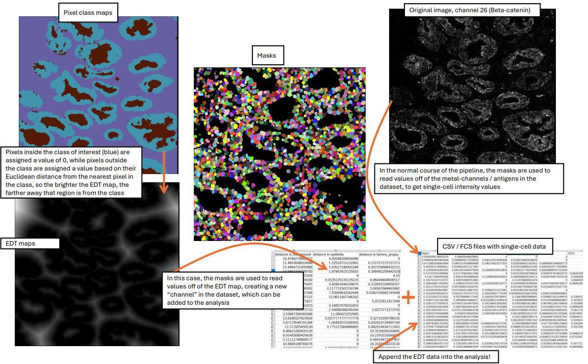
Then, a distance calculation can be performed using a Euclidean Distance Transform (EDT) on the pixel classes of interest, which is why this module is frequently referred to with the label EDT.
Graphical Summary of the EDT method:
EDT calculation window:
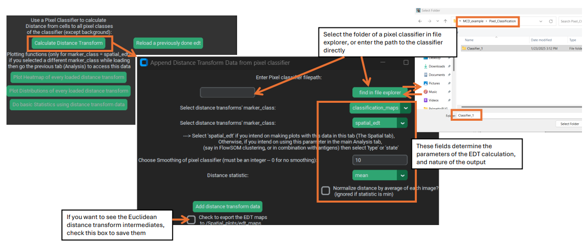
The key parameters for the EDT calculation are as follows:
1&2). The filepath to a pixel classifier directory & type of prediction sub-folder. Critically, within the provide folder there must be two things within the classifier directory: a). A biological label CSV to identify its classes (this is automatic for supervised classifiers, since you must assign the labels before creating them), and b). a sub-folder with predicted pixel classification maps for every image in the dataset. Because PalmettoBUG pixel classifier’s can have two different kind of prediction maps (the original classifier predictions in a /classification_maps subfolder or merged predictions in a /merged_classification_maps subfolder), this must be specified in the drop down immediately below classifier selection.
Note
If you use the /merged…maps folder for a supervised classifier, the background class will not have an EDT calculated. This is often preferable, unless the “background” class has some biological meaning of its own!
3). Marker_class. This determines how the newly added EDT channel(s) are treated once merged into the analysis – will they be “type”, “state”, “none”, or a new marker_class “spatial_edt”? The default is the new “spatial_edt” class, because it is assumed that you will want to treat the EDT channels differently than the regular channels and because “spatial_edt” channels are treated specially in the GUI – the dedicated EDT plotting buttons in the spatial tab only works for “spatial_edt” marker_class. However, if you wanted to cluster your cells based on EDT values, you would want to set them to “type”, and then return to the analysis tab and run a FlowSOM / Leiden clustering.
4). Smoothing threshold. Isolated regions of the pixel class of interest in the pixel classification maps that are smaller than the smoothing threshold will be excluded. This is included because pixel classifiers (especially unsupervised ones) can find very small regions of a given class, which might be biologically irrelevant. Further, a Euclidean distance transform is very sensitive to the presence of even a single pixel of the class of interest, as a single pixel of the class of interest can create a large circular region of lower EDT values around it.
5). Statistic. This determines what aggreagate statistic is used to summarize the EDT value inside a cell mask. Much like when reading the region properties during the main pipeline of the program, the statistic when reading the EDT values from the mask region does not have to the be the mean value (even though this is typical) of the pixels inside the mask. Mean, median, and minimum are the options provided by PalmettoBUG, with minimum being a particular interest in this case as that would represent the minimum distance between a cell and the pixel class of interest.
6). Normalization. Images with more pixels in the class-of-interest will naturally tend to have lower EDT values across the image (and vice-versa) – although this is also affected by the distribution of the class within thimage. Having a generally lower EDT value in an image will in turn affect the EDT values of the cells. Typically, though, you are not interested in only if there is more the pixel class in an image, but whether particular cell types are more or less associated with the pixel class than you would expect by chance. Checking the normalization option means that the EDT value for every cell will be divided by the average EDT value across the entire image that cell came from, which is intended to help control this effect. Note that normalization only works if the aggregrate statistic is median or mean, not minimum.
Attention
When calculating the EDT values, PalmettoBUG will calculate EDT values using every class in the selected classifier, assigning them all the same marker_class. Typically, it is best to make dedicated supervised classifier for each object of interest, so this should not be an issue, although for some applications (like when identifying mutually exclusive regions, like tissue layers) you may want to have multiple classes in one pixel classifier.
EDT plots and statistics
Once the EDT values have been added to the analysis, there are a few possibilities about how you can use them.
If you added them as “spatial_edt” marker class, then they will be accessible to the handful of dedicated EDT plotting functions in the spatial tab – which will be focus of this section. However, they are always accessible to ANY function that can use the selected marker_class, including in the analysis tab! This means any plot, clustering, dimensionality reduction, etc. covered in the Single-Cell Analysis documentation could take an EDT channel as an input. However, if you do choose ‘type’ as a marker_class (for example), then your EDT calculations will be plotted along with all the other channels set to ‘type’, which is usually more confusing than useful.
The outputs of the dedicated EDT functions are shown below:

Key points include 1). the heatmap requires at least two markers with the marker_class “spatial_edt” to run. 2). The statistics function in the spatial tab is just a convenience wrapper on the “state expression ANOVA” from the analysis tab – it is the same function, just only for “spatial_edt” channels. 3). Whenever you are looking at EDT values, it critical to remember that higher numbers mean greater distance from the target pixel class, and lower number means greater proximity to the class.
Save / Reload EDT:
Whenever you run an EDT calculation, the results of the calculation are saved in a CSV file in the analysis, under the name of the classifier folder that you used! If for any reason you need to reload an EDT calculation or change the marker_class of EDT channels in a classifier, such as if you exit / re-enter PalmettoBUG — then you can directly load the EDT from the CSV, setting the marker_class when you do so, instead of needing to redo the calculation.
Links
These are links to some packages / software / manuscripts that can be helpful to understand this page of documentation, as either code or techniques / ideas from these are used in PalmettoBUG’s spatial module.